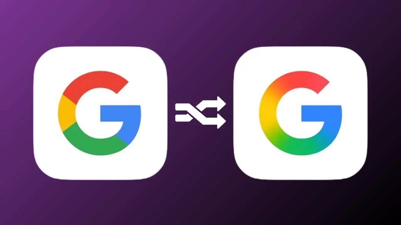
Google’s New Logo: After a decade of its iconic ‘G’ logo, Google has unveiled a stunning Google new logo that’s turning heads in the tech world. Launched quietly on May 12, 2025, just before Google I/O 2025, the redesigned G icon features a vibrant gradient of red, yellow, green, and blue, replacing the familiar solid color blocks. This Google logo redesign marks a bold step toward a modern, AI-driven brand identity. In this article, we explore the new gradient logo design, its significance, public reactions, and what it means for users and businesses.

A Fresh Look for the “G” Icon
The Google new logo is all about subtle sophistication. The updated G icon swaps sharp, solid colors for a fluid gradient logo design that blends Google’s signature red, yellow, green, and blue hues. The corners are softened, giving the logo a smoother, more approachable feel. First spotted on the Google Search app for iOS, the redesign has also appeared on select Android devices, signaling a broader rollout. This change aligns with tech logo trends in 2025, where gradients and minimalism dominate brand visuals.

Why Google Redesigned Its Logo
The Google logo redesign isn’t just cosmetic—it reflects the company’s evolving identity. With a focus on AI innovations like Gemini, Google is positioning itself as a forward-thinking leader in technology. The gradient G icon mirrors the dynamic, adaptive nature of AI, while the softened design feels more human-centric. Launched ahead of Google I/O 2025, the logo sets the stage for new product announcements and a refreshed Google branding strategy that emphasizes creativity and accessibility.
Public Reactions to the Google New Logo
The Google new logo has sparked a mix of excitement and nostalgia online. Tech enthusiasts on social platforms praise the gradient logo design for its modern, vibrant appeal, noting it aligns with Google’s innovative spirit. However, some users miss the classic solid-color G icon, citing its clarity and timeless simplicity. This divide reflects the challenge of updating one of the world’s most recognized logos—change is bold, but tradition runs deep.
What the Google Logo Redesign Means for You
For everyday users, the Google new logo is a visual refresh that may subtly enhance app experiences, making interfaces feel more cohesive. For businesses and marketers, the Google logo redesign offers an opportunity to align with tech logo trends. Here’s how to leverage it:
-
Update Branding: Incorporate gradients into your visuals to stay current with 2025 design trends.
-
SEO Boost: Create content around “Google new logo” or “gradient logo design” to capture trending search traffic.
-
Engage Audiences: Share your take on the G icon redesign on social media to spark discussions.
As Google rolls out the new G icon across its platforms, it’s a reminder that even small changes can have a big impact in the digital world.
Also Read: – Vivo X Fold 5 Price in India and Game-Changing Features Revealed
Conclusion
The Google new logo is more than a design tweak—it’s a statement of Google’s vision for the future. With its vibrant gradient logo design and softened G icon, the Google logo redesign blends modernity with familiarity, setting the tone for Google I/O 2025 and beyond. Whether you love the fresh look or prefer the classic, there’s no denying this change has everyone talking. What do you think of the new Google branding? Share your thoughts in the comments!